Persimmon: The Bold, Cheerful Color Taking Over This Spring—5 Ways to Style It
Spring is all about fresh starts—and what better way to energize your space than with a vibrant new color? This year, Persimmon is taking center stage. A rich, reddish-orange hue that's equal parts cozy and lively, Persimmon is popping up everywhere from home decor to fashion. Designers love how it bridges the gap between playful brightness and warm comfort, making it an easy choice for anyone looking to refresh their style.
Persimmon feels sunny and spirited, yet it's not overpowering when used thoughtfully. Whether you’re ready for a bold makeover or just want a few lively accents, here are five smart ways designers suggest incorporating this juicy shade into your home:
1. Treat It Like an Accent Color
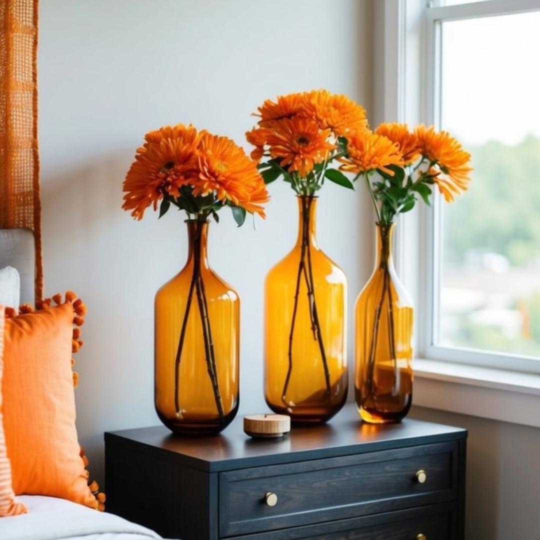
Because Persimmon is such a vivid hue, it's best used with intention. Think of it the way you would think of bright pink or vibrant turquoise—small doses pack a big punch. Try weaving it in through accessories like throw pillows, vases, artwork, or lamps. These small moments of color can instantly lift the mood of a room without overwhelming the space.
Designers suggest following the “25% rule” if you want a balanced look: let Persimmon make up no more than a quarter of your overall color palette. The remaining 75% should stay neutral, allowing Persimmon to shine as a lively accent rather than taking over the room.
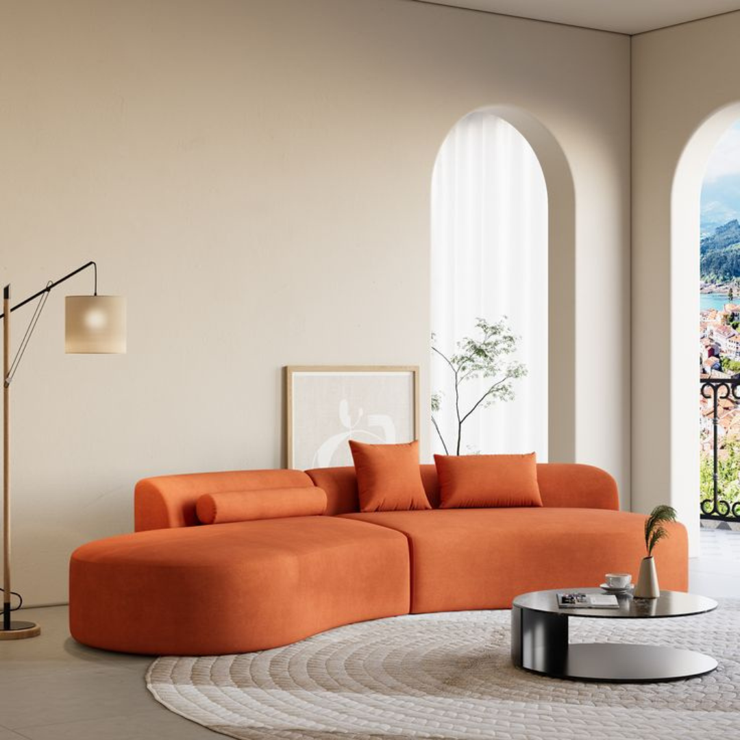
2. Pair It with Neutrals for a Grounded Look
Persimmon plays exceptionally well with neutral tones. Earthy beiges, creamy whites, soft taupes, and warm grays all give Persimmon the perfect backdrop to glow without feeling too loud. If you want a relaxed, sophisticated vibe, stick with natural textures like linen, jute, or rattan alongside Persimmon accents.
For example, a Persimmon-hued throw over a neutral-toned sofa or a pair of orange-toned chairs around a light wood table can make a room feel elevated and warm, not busy or chaotic.

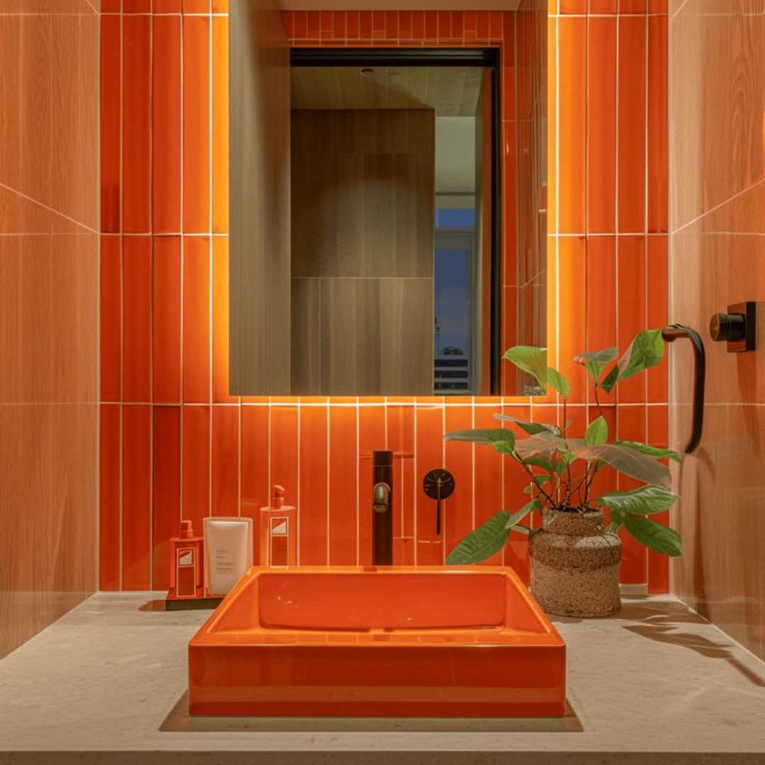
3. Use It to Warm Up Small Spaces
If you're not ready to go bold in large living spaces, Persimmon is perfect for energizing smaller areas. Powder rooms, mudrooms, entryways, or reading nooks are great places to experiment with this vibrant hue.
A Persimmon-painted powder room, for instance, feels cheerful and welcoming, while an entryway with a Persimmon bench or runner sets a bright, friendly tone as soon as you walk through the door. In small doses, this color makes spaces feel cozy and inviting without feeling claustrophobic.
4. Layer It with Other Vibrant Colors
Feeling adventurous? Persimmon can be even more dynamic when layered with other bold hues. Designers love pairing it with deep teal, olive green, mustard yellow, or even a dusty rose.
This approach works especially well if you’re going for a more eclectic, bohemian, or globally inspired look. Picture a room where a Persimmon accent chair sits next to a teal rug, with mustard-colored throw pillows and leafy green plants tying it all together. The trick is to balance saturation and keep a few neutral elements so the space still feels cohesive.
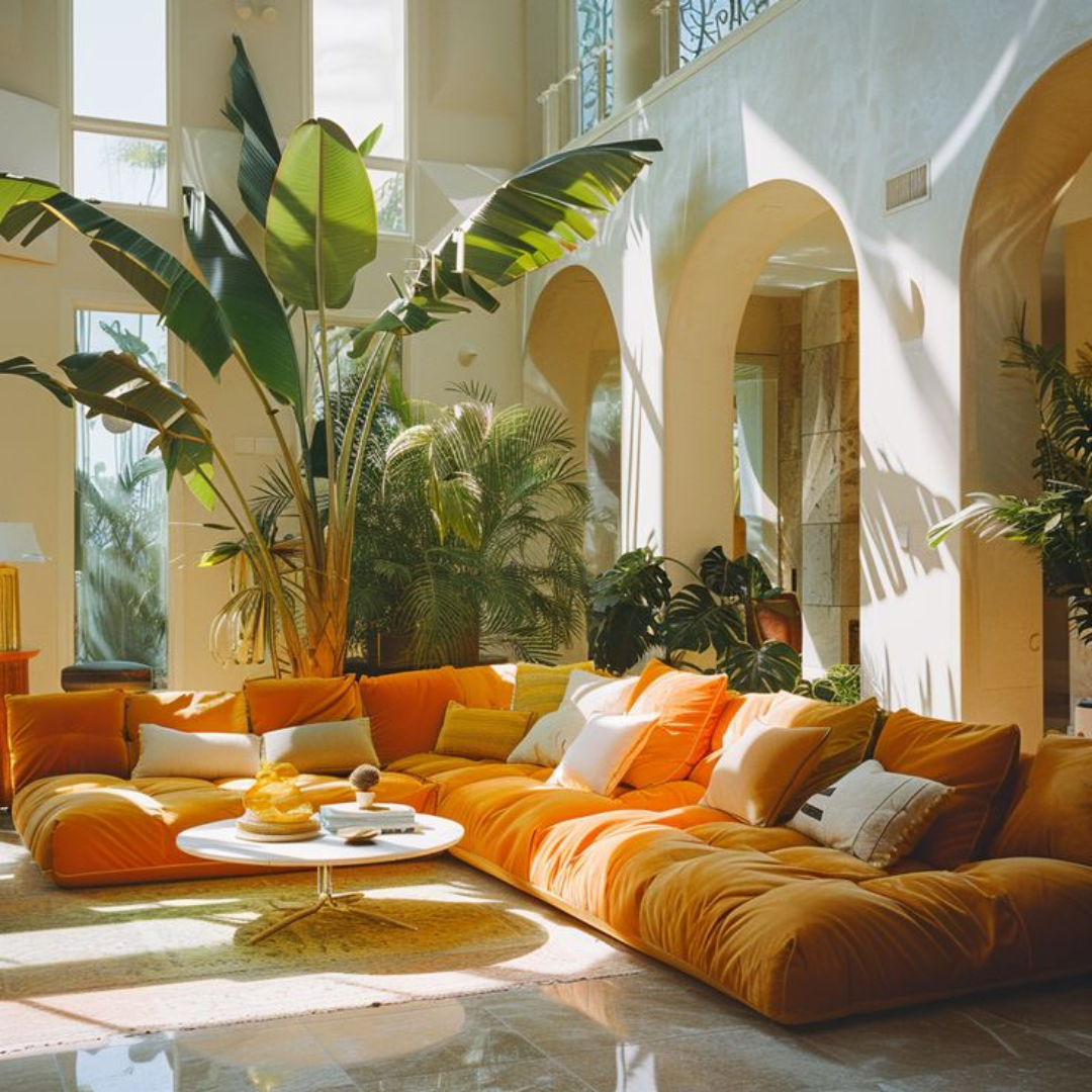
5. Make It the Star of a Statement Piece
If you're ready to fully embrace Persimmon, let it be the hero piece in your space. A velvet Persimmon sofa, a bold painted kitchen island, or a bright Persimmon headboard can transform the feel of an entire room.
When Persimmon is the statement, keep surrounding elements simple and neutral so it doesn't have to compete for attention. A bold piece in this shade not only draws the eye but also makes a space feel joyful, lively, and full of personality.
Persimmon offers the perfect mix of warmth, energy, and cheerfulness. Whether you’re ready to dive in with a bold statement or just want to sprinkle it in through accents, this color can instantly breathe new life into your home this spring. Use it wisely, balance it with neutrals, and don't be afraid to have fun with it. Your space—and your mood—will thank you.
FOR NEWS INQUIRIES
Kyle Henry
Director of Marketing
Kyle.H@CarolineHuo.com
650.727.1308
Share & Stay in the Know